Stop Using Your Logo Color Everywhere
Here's What Great Branding Really Looks Like
Color matters – but context matters more.
Just because your logo is red doesn’t mean every headline, button, and background on your site should be red too.
We see this mistake far too often: brands relying on color alone, hoping it will carry the entire visual identity. The result? Confusion, inconsistency, and lost impact.
Let’s break it down with three real-world examples.
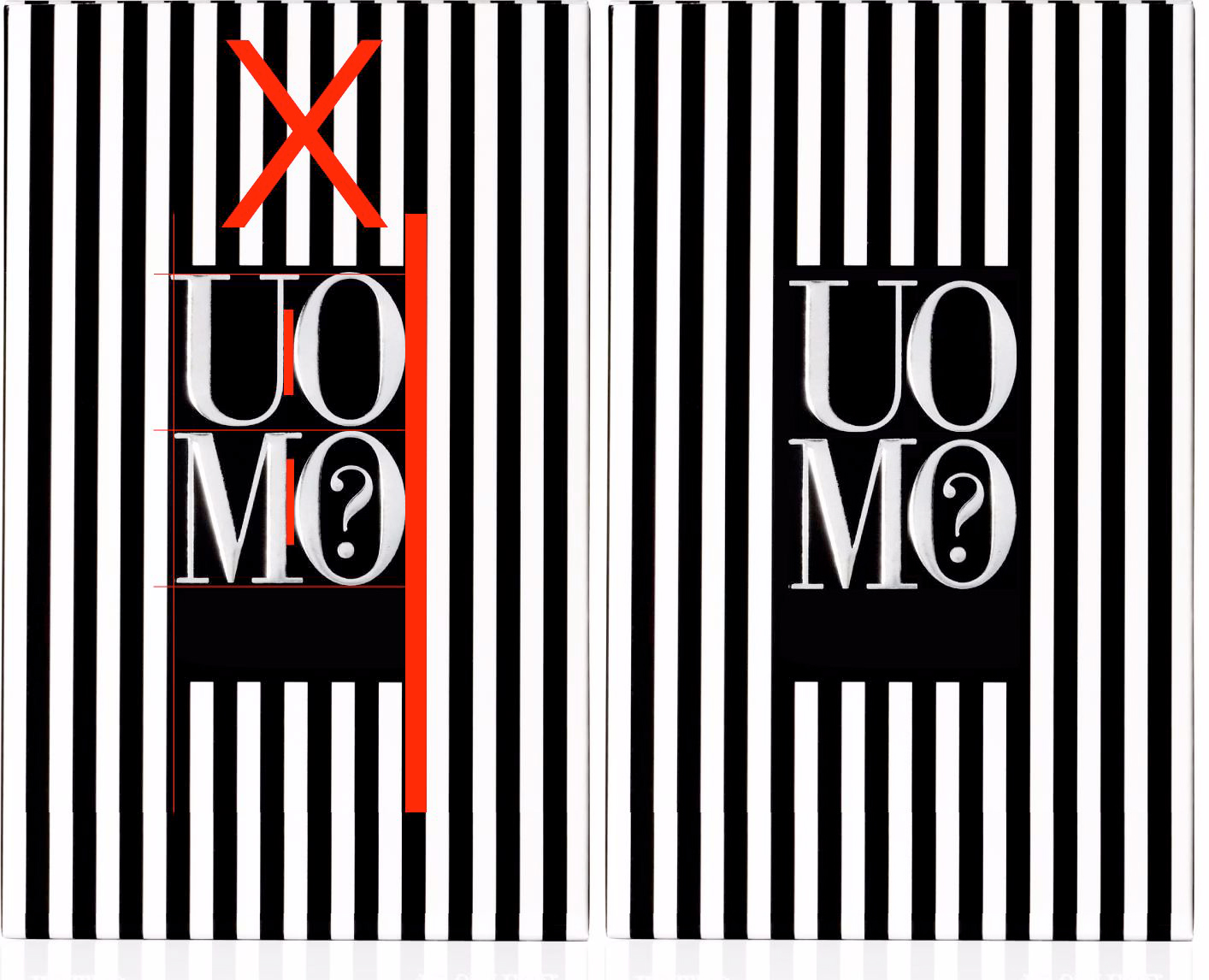
Image 1: When Your Brand Colors Hurt Your Brand
This is the classic error: using your brand colors for text and backgrounds without considering readability or contrast.
It might stay “on-brand,” but it fails visually – making it hard to read and even harder to trust.
Pro tip: Not every brand color works for every application. Choose contrast over loyalty when it comes to readability.
Image 2: Visually Better – But Still Missing the Message
Now we’ve improved the visibility. But the design still falls flat.
Why? Because it says nothing about who you are or what you do. The visuals are bland, and there’s no emotion or identity.
Ask yourself: If someone sees this for the first time, do they understand what we do?
Image 3: This Is What Strategic Design Looks Like
The right image, the right color balance, and the right message – instantly, it tells a story.
You feel that this is a creative agency. You see the clarity. You remember the brand.
This is not decoration – it’s positioning.
Takeaway: Branding Isn’t About Looking Pretty. It’s About Being Understood.
Great branding doesn’t just look good – it communicates.
At PANTIX, we build visual identities that combine creativity with strategy – so your audience sees you, gets you, and remembers you.
Want a brand that speaks before you say a word?
Let’s talk. Your next-level branding starts here.